To run a successful email campaign, it is highly important to take utmost care of content. Content forms the core part of any email campaign and has to be responsive, elegant along with professional looking email designs.
Zoho Campaigns brings easy-to-use drag and drop template editor to create beautiful and professional email templates. In this guide, we’re going to discuss how to use drag and drop components to create email templates
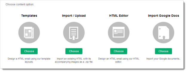
You can design a HTML email with one of our template layouts where you can upload images, add text, have options for button, inline image, anchor tag, and easy customization of the layout using the dropdown feature.
Based on your requirements we have categorized our templates, thus helping you create an HTML email of your choice. Here are your options:
Using this drag-and-drop editor, you can design email templates from scratch. The best part is that you don’t have to be a design pro or require the knowledge of HTML and CSS to create these templates. Now, let us find out the different components to be used in creating email templates.
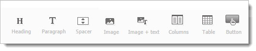
To add a component to the editor, do any of the following:
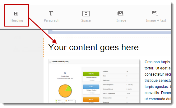
Using this component, you can add different types of headings and customize the font style, size and shape.
Note
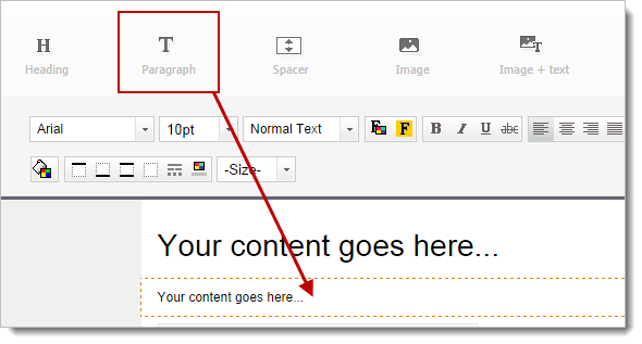
This component is used to add content and the text gets wrapped automatically. Once you add the component, you can write and edit the content in the template editor.
You can add this element between two components to create a blank space of your preference. Spacer provides the better control of space in overall page layout and template design. You can adjust the height of spacer by hovering over the green Resize icon. You can also customize and change the background color of the spacer.
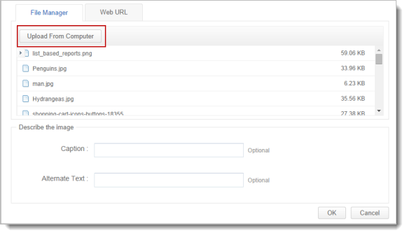
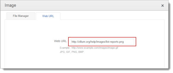
You can use this component to add images to your template. All you need is to drag and drop the component to template editor. When you select the image component, a pop-up window will appear.
Here you’ll have three different options to add the image:
Note
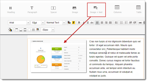
Using this component, you can add images and text in the same section of the template editor.
Note
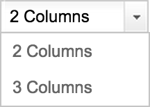
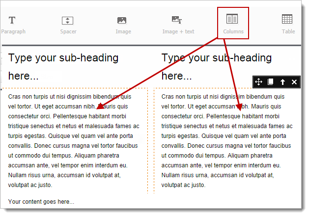
You can choose a layout for your email template. You can either proceed with two-column or three-column formats.
Do’s and Don’ts
Note
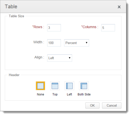
You can use this component to add table to your email template. All you need is to drag and drop the component to template editor. When you select the table, a pop-up window will appear to add rows and columns to your template.
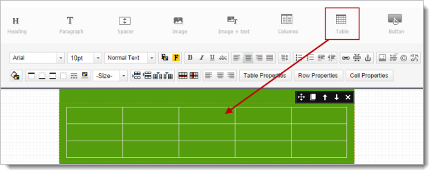
Apart from that, you can set up the properties such as width size (percent or pixels), alignment, and header details.
Note
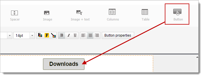
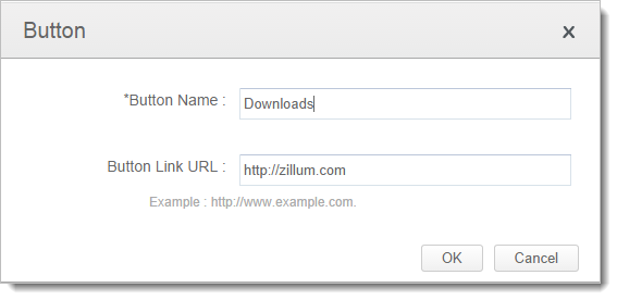
You can create a button in your email template that redirects to a webpage or a landing page to download a file. Button or to be more precise call-to-action button is the most popular and easiest way to make your recipients click your campaign and increase the click to open ratio.
| Custom Toolbar | Description |
|
| Font Style – This property changes the font style, size, color, boldness, italics, etc. |
|
| Alignment – This property aligns the content to left, center, right and justified alignment. |
|
| Line Height – This property modifies the spacing between text lines. |
|
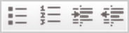
| Bullets & Numbering - This property marks the text using bullet points or numbering system. |
|
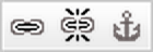
| Hyperlink – This property is used to redirect a text, image or button to another page. |
|
| Inline Image- This property adds an image along with the text so that it will look as if it was another part of text. |
|
| Background color – This property sets the background color of an element. |
|
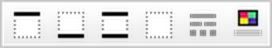
| Border Properties - This property allows specifying the style, size, and color of a component and specifies what kind of border to display. |
|
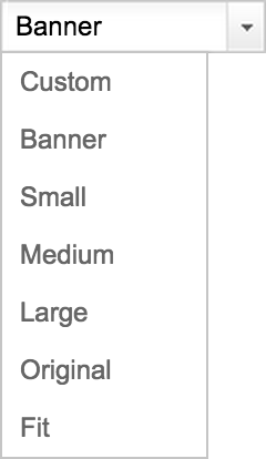
| Image Size – This property helps to resize the image to small, large, banner, custom, fit, original, etc. |
|
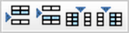
| Column Layout – This property helps you to choose a layout for your template. It can be 2-column or 3-cloumns layout based on your needs. |
|
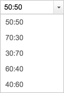
| Column Ratio – This property sets the width for the columns in the 2-cloumn or 3-column layouts. |
|
| Insert Row/Column – This property allows adding rows and columns in your table. |
|
| Delete Row/Column - This property allows deleting rows and columns in your table. |
|
| Table properties - This property allows to customize the number of rows, columns, width, alignment and header of a table. |
|
| Row Properties – This property allows you to customize the height of a row and align the text to left, right, center, middle, baseline and bottom. |
|
| Cell Properties - – This property allows you to customize the width and height of a cell and align the text to left, right, center, middle, baseline and bottom. |
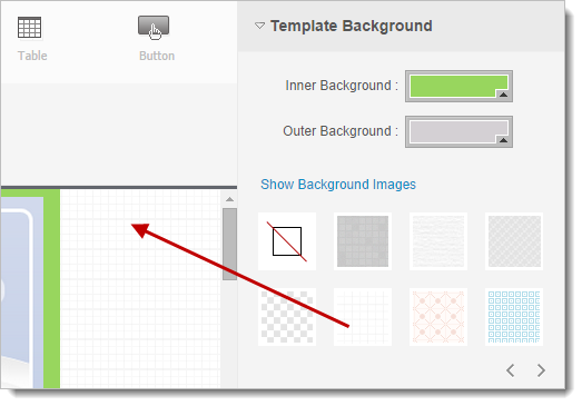
Background Color - You can choose a background color for your email templates from the wide range of colors.
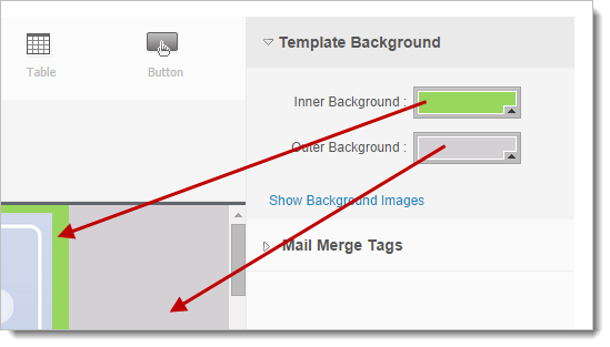
Background Images - You can customize the template background by adding the images from for your email templates from the wide range of image collections.
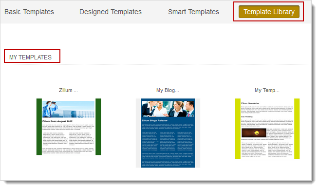
Why create the same template again and again? Save all your designed templates and build your own library. The next time you have to send a similar campaign, all you have to do is to just choose the best template from your own creations!